
Sometimes you have a nice, long web article and you just want to sit back and read it, without the ads and headers and footers and other clutter. Maybe a nice sepia background, with an easy to read brown font (my favourite)
Or just easily send it from your PC to ‘read it later’ on the phone or tablet. Offline, when I’m on the train or in bed. Plus in the above de-cluttered view.
Some free tools to help:
Instapaper
Firstly you create a Instapaper free account, then:
- Install the free browser plug in on your PC etc
- Install the free app on your phone or tablet (or both, in my case)
So, here’s a sample web page someone sent me this very day. It’s a long piece and I’m sitting here on the PC. I want to read it later, off-line on the iPad.
In the Browser I click on the Instapaper icon to activate the plug-in/extension. It may ask me to sign on, if I haven’t already. Then it saves the article and sends it to my Instapaper cloud account.
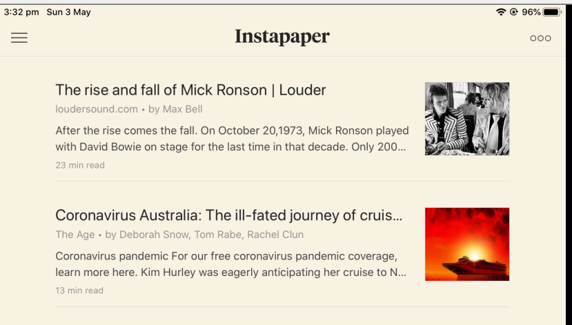
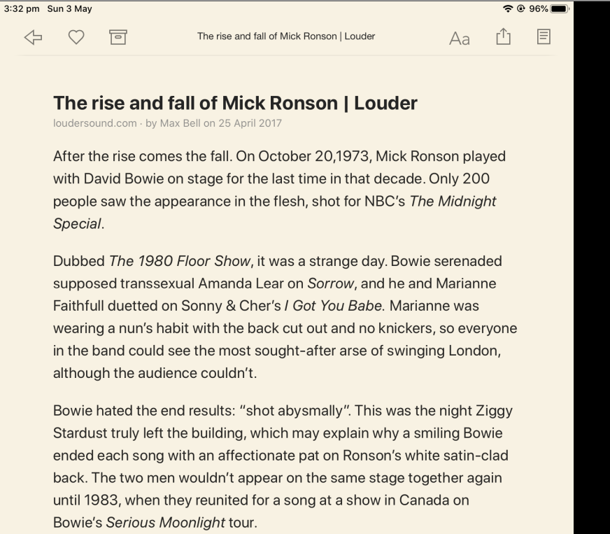
On the iPad I just start the Instapaper app – log in the once – and it syncs (downloads) any new articles. I can then just select the Mick Ronson one and read it. I can change the colours, fonts etc:
Apple’s Safari Browser : Reader View
I only have an iPad (no iMac) so I can only advise that this is built in to the Safari Browser on the iPad.
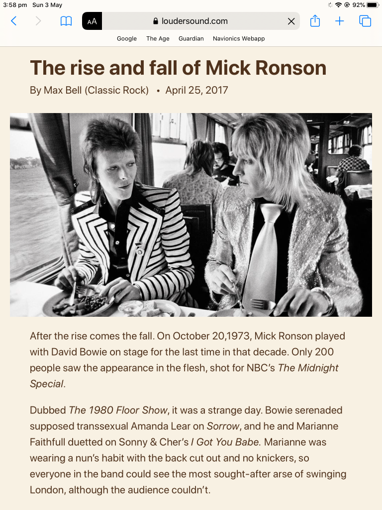
It’s called Reader View but only works online; it’s showing a decluttered view of the ‘live’ web page inside the Browser. No external app needed. It’s a good piece of thinking from Apple and well implemented. I wish other browsers would support it. I’ve tried a few add-ons, but none seem to be as good as this.
To use: just click on the ‘double A’ icon in the browser’s top bar and select Show Reader View. And it does just that:
RB Digital
Something a bit different. This is the free eMagazine app that a lot of libraries use to download and display their free eMagazines. BTW it calls them ‘PDFs’ but I’m not so sure. Anyway the default view is the ‘facsimilie’ of the printed magazine page, aka “it looks just like the real thing”:
The above is actually a screenshot. Small font, multi-column layout, white-on-black text. Okay may not be that easy to read. So click on the Text icon at the bottom…and tada:
That’s better. Some images are there, but shrunk and moved to be less intrusive. You can easily click on the PDF icon at the bottom to return to the facsimile view.